Hong Kong News

Lukstudio Draws on Open-Air Market Aesthetics for a Modern Grocery in Changsha, China
In creating The Assembled Market in Changsha, China, for the region's new supermarket brand, Fresh Mart, the design team envisioned a contemporary gathering space that offers more than meticulously stacked shelves. "Growing up in Hong Kong, I have always loved the experience at Dai Pai Dong-a name we called these ad-hoc structures in wet market or a street corner where local dishes are served," says Christina Luk, founder and director of Lukstudio. "In fact, throughout Asia, outdoor street markets are often where you encounter authentic local delights and cultures, as opposed to most cookie-cutter supermarkets."
To invite a similar sense of discovery indoors, Luk and her team referenced the aesthetics of outdoor markets, creating a streamlined space that functions as a shopping destination. Located next to several high-end residential compounds in a newly developed area of the city, the expansive store also features a restaurant and café area, conceived as an open-air food stall, defined by bamboo tables, rattan chairs, and wooden lattices. Above the fresh fruits and vegetables hangs a series of metal mesh canopies. "We wanted to create the experience of walking down the aisles in a local Chinese outdoor market full of hanging tarpaulins," explains Luk. "So our take is a series of metal mesh canopies mimicking these temporary structures." Stacks of milk creates seen on the facade and in the dry goods section also serve as a nod to those used outdoors.
Given the popularity of ordering groceries online, Lukstudio set out to create a physical supermarket that enables customers to build a sense of community, away from their screens. "Our intent was to create a modern supermarket with a sense of Chinese traditions, but without the look of a stage set. To achieve the visual balance, we took an assembly approach," Luk shares, noting the project name. Each layer of the space, from the wooden frame that runs throughout to the palette of earthy hues, succeeds in transforming grocery shopping from a "must do" to a simple pleasure. 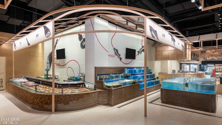
At the corner where the butchery turns into the fishmonger, apart from a lively wall graphic linking the sections, a material gradation along the counter intends to smooth the transition. Photography by Dirk Weiblen Photography. 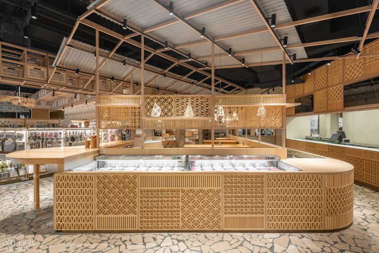
The dining area is conceived as an open-air street food stall and lattice screens are used as a visually permeable barrier between dining and shopping, but also a unifying texture wrapping around counters and equipment. Photography by Dirk Weiblen Photography. 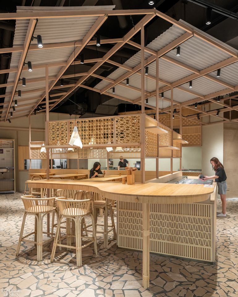
Bamboo tables, rattan chairs and flagstone pavers together compose a Chinese vernacular, recalling the memory of having humble yet authentic dishes at an outdoor local joint. Photography by Dirk Weiblen Photography. 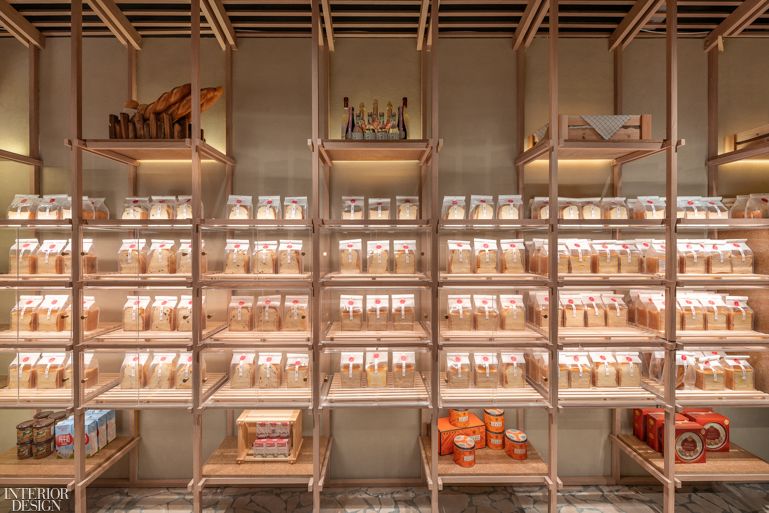
At the bakery cabin, a grid extends from the gable roof structure and becomes the framework of an orderly bread display. Photography by Dirk Weiblen Photography. 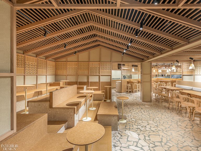
By replacing corrugated panels into the purlin structure, the wooden frame gives form to a gable-roof cabin above the cafe, optimizing the original low-ceiling space with terraced seating. Photography by Dirk Weiblen Photography. 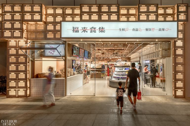
The street facade and the nearby dry goods section are marked by stacking milk crates, which convey a sense of order to the busy racks and double as a lighting feature at night. Photography by Dirk Weiblen Photography.


